Grout color has a bigger impact on your finished tile installation than most people realize. The right choice enhances your tile; the wrong choice can undermine the entire design. Here is how professionals approach grout selection.
Matching vs. Contrasting
Matching Grout
Grout that matches your tile color creates a seamless, unified look. Benefits include:
- Makes the space feel larger
- Hides minor installation imperfections
- Creates a calm, cohesive aesthetic
- Better for large format tiles
Contrasting Grout
Contrasting grout highlights your tile pattern and creates visual interest:
- Emphasizes tile shape and layout pattern
- Adds drama and visual interest
- Works well with subway tile and geometric patterns
- Shows more dirt — requires more maintenance
Practical Considerations
Maintenance Reality
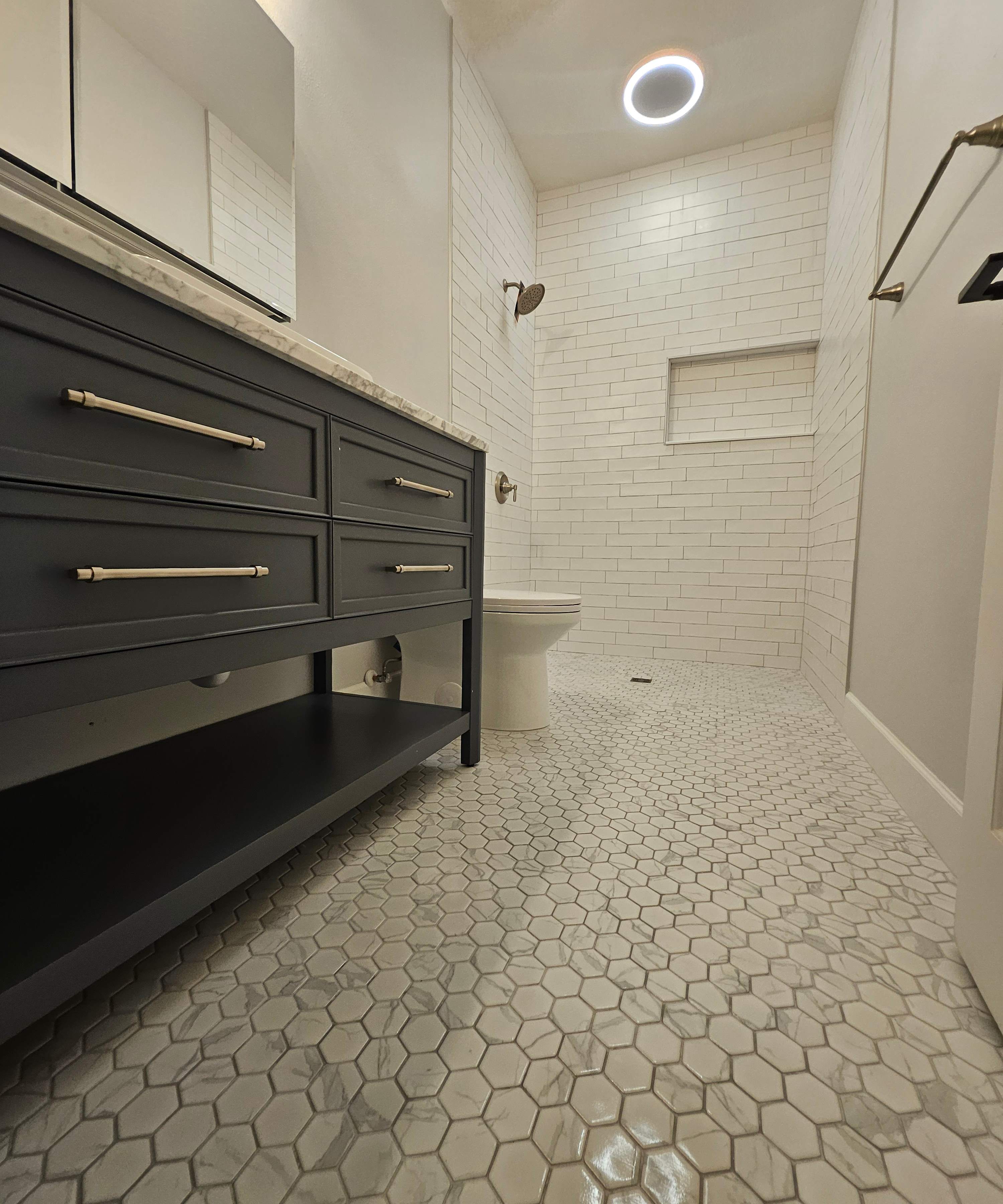
Light grout in high-traffic or wet areas will show dirt more quickly. In showers and on floors, consider mid-tone grays that hide dirt while still complementing your tile.
Grout Width Matters
Wider grout lines make color more prominent. If you are using a contrasting color, narrower grout lines (1/16 to 1/8 inch) create a more subtle effect.
Popular Grout Colors
Warm Grays
Versatile and forgiving, warm gray grouts work with most tile colors and hide dirt well. Popular for bathrooms and kitchens.
Bright White
Classic choice for white subway tile. Requires more maintenance but creates a crisp, clean look.
Charcoal and Black
Bold choice that adds drama. Works beautifully with white or light-colored tiles for maximum contrast.
Color-Matched
Many grout manufacturers offer colors matched to popular tile lines. Ask your tile supplier about coordinating grout options.
Testing Before Committing
Always test grout color before installation. Grout looks different wet vs. dry, and lighting affects perception. Apply samples to spare tiles and view in your actual space.
Need help selecting the perfect grout for your project? We bring samples to every estimate and can guide you through the options.